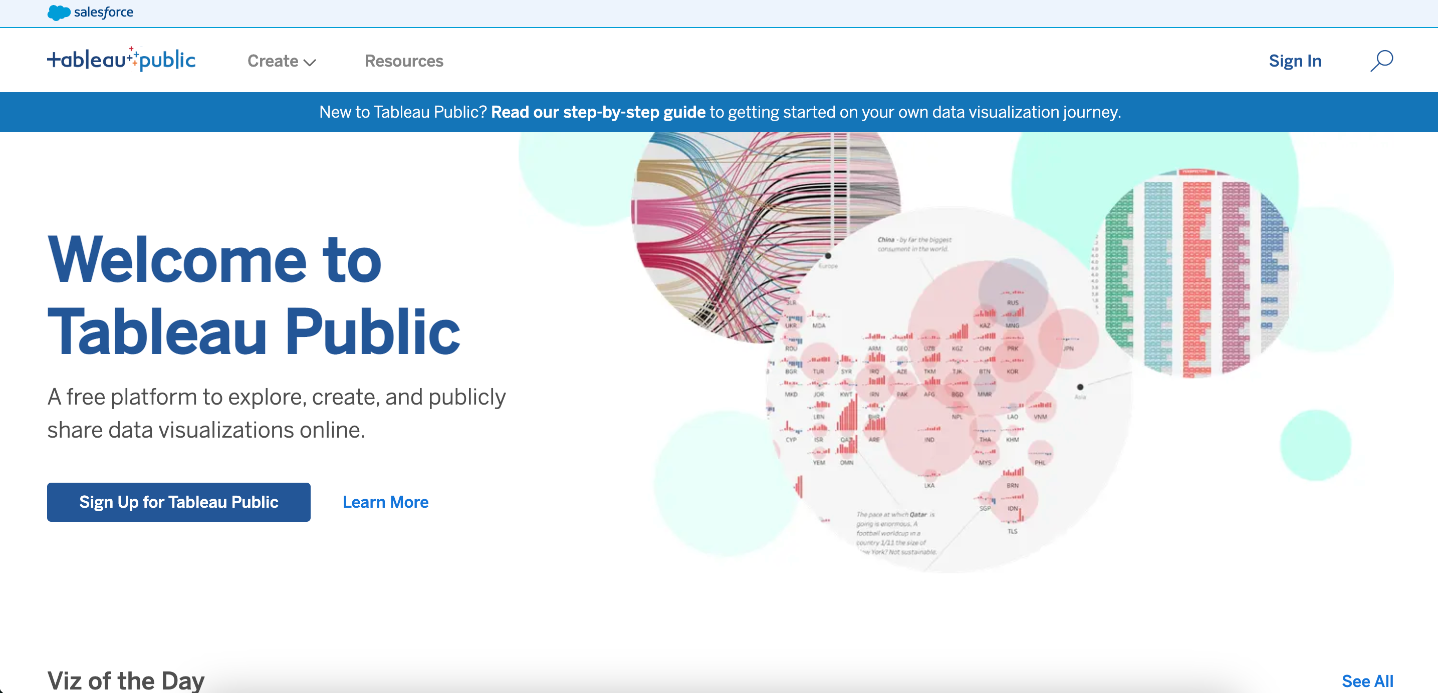

From my Tableau Public Jobs to be Done study, I recommended a homepage redesign in order to better connect users with the content they wanted to see. I then worked with designers on the Public team using the feedback from the JTBD study to create a prototype of a new home page. Once the prototype had been designed, I proposed we assess user opinions of the page before launch to ensure we had accurately addressed some of the issues found in the JTBD study, and to allow time to iterate on the design before release. This study therefore aimed to compare user opinions of the previous (current at the time) Tableau Public homepage to a proposed update to the page in order to provide qualitative insight into the impact of the update. This study also served as a test run of the UserTesting.com software for my team.
I used a qualitative A/B test to answer the main research questions, as this was the perfect opportunity to pilot an unmoderated user testing software called usertesting.com for my research team. The study consisted of two unmoderated user tests with identical lines of questioning concerning two distinct Tableau Public home pages. The study also served as an ideal trial scenario for usertesting.com, as I only tested user impressions of one single screen. I gathered qualitative information such as user impressions of the home page, what they imagined the site was for, where they’d click next, and what they were confused about.
Test A consisted of 22 participants who were shown the old landing page, while test B consisted of 18 participants who were shown the proposed landing page prototype. Test A contained more participants due to several pilot runs of the user test.
Participants in both phases were a split of Tableau creators versus non-creators, and of Tableau users versus non users. This allowed me to understand most everyone’s potential impressions of the Tableau Public home page, regardless of Tableau experience.
I found quite a few discernable differences in users’ impressions of the proposed home page as compared to the old home page. The main difference I identified (and what I’m allowed to get into) was that users better understood the purpose of Tableau Public when presented with the new proposed home page. The site no longer seemed like an information page or an advertisement, instead it prompted users to immediately explore the content available rather than ask additional questions about the nature of the site. This aligned well with the ultimate goal of the proposed home page update.
I also put forward my recommendation and built out a how-to guide for best-practice uses of usertesting.com for the rest of Tableau research. The software provided an efficient way to run unmoderated research for less intensive research projects, such as questions concerning single web page layouts.
This study prompted the launch of the redesigned Tableau Public home page (with some more minor adjustments) pictured below, which has been a huge success. The redesign more efficiently connects users with relevant content and has increased the number of learning resources available while shortening the user pathway required to access them.

Additionally, usertesting.com became much more widely used by the rest of Tableau research at my recommendation, and I became a regular advisor for how best to run studies using the tool.